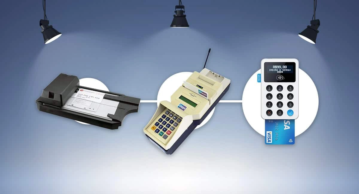
Old-school card machines typically came in black or silver grey. We all remember the push-button Ingenico and Verifone models that used to dominate retail and food-and-drink spaces ten years ago.
This all changed in the last decade. Square was the first to launch a white swipe card reader in the US in 2011. The first models from European fintechs SumUp and Zettle were black, then soon replaced with new, hugely popular white card readers.
As it turns out, the psychology of colour in a retail environment does matter for purchasing decisions.
Photo: Emmanuel Charpentier, Mobile Transaction

In recent years, SumUp has offered only white card machine models.
White dominates new card machine sales
If you visit shops in almost any European city, more white card terminals are seen than just a few years ago.
The rise of white has coincided with the declining market share of Ingenico and Verifone. A winner, maybe in some way due to its colour, is the sleek PAX A920 terminal.
Fast-growing payment company Dojo offers this model as Dojo Go, featuring turquoise buttons and detailing on its countertop cradle.
Photo: Emily Sorensen, Mobile Transaction

The Dojo Go terminal PAX A920 in white with turquoise details.
Another UK payment provider, Takepayments, told Mobile Transaction that most new merchants sign up for their smart terminals Takepayments Plus or Takepayments Easy, based on the white PAX A920. The Ingenico Move/3500 – also a technically sound terminal – sees less traction.
“In the beginning, we saw a particular demand from the beauty segment, for example hairdressers and beauticians, for white. Now, PAX A920 is our best-selling terminal in any industry,” says Marc Varlow, sales manager at Takepayments.
Charcoal grey can also be a design statement
A dark grey close to charcoal, or ‘black’ as Zettle calls it, has proven a popular alternative to white with Stockholm-based payment company Zettle. The Zettle Terminal launched in 2021 is definitely a design statement, and comes in a dark grey colour only.
Zettle Reader, which has become a familiar terminal across Europe, was first sold in white only. An alternative in black was later offered to satisfy demand. While the white has been more popular, the limited-edition black was occasionally sold out.
Photo: Emmanuel Charpentier, Mobile Transaction

myPOS Carbon comes in charcoal/black, which looks great in different contexts.
Not only does black appeal from an aesthetic point of point, it’s also the more practical colour for car garages, plumbers, kitchens and anywhere else where dirt might soon appear on an otherwise light colour.
We know from hospitality cashiers that it’s more difficult to make a food-stained white card reader look clean, whereas black terminals camouflage dark marks.
Black and white combo
Colour was also central to the design of the futuristic looking Revolut Reader, which was launched in the UK and Ireland in 2022. Revolut also opted for white as the outer casing, but with a dark touchscreen taking up most of the front surface, resulting in a dual colour look.
Photo: ES, Mobile Transaction

Revolut Reader features a casing in white, but the dominant black touchscreen is integral to the look
According to product owner in Revolut Business, Luís Leal, the colour choices were carefully thought through:
“When considering the shop environment in which merchants will place the reader, we found a more neutral colour would fit better. White gives a clean appearance and often a good contrast with a merchant’s counter. The black front then comes natural as it helps with the contrast and connects well to our display appearance.”
Instagram-friendly counter
Research conducted by Zettle on its own customers revealed that the design and colour of the terminal matter to many. It may not be so surprising that visuals matter more in the age of Instagram.
“I like the way it looks on the counter,” owner Erik Heggestad of Svenska Armaturer told Mobile Transaction about his Zettle Reader paired with the POS system Zettle Go on an iPad. With 37,000 followers on Instagram, his shop is frequently photographed. Few design elements are left to chance.
Photo: Edle Tenden, Mobile Transaction

Svenska Armaturer in Stockholm uses Zettle Reader with the point of sale system Zettle Go.
Latin countries go for more colour
In a country like Brazil, white and black are the exceptions – colours dominate.
European-headquartered SumUp introduced a black card reader for the phone’s audio jack socket in Brazil in 2013. It then switched to white for its next model a couple of years later. The company, which has stuck to white card readers for the last 8 years, has lost market share to its more colourful competitors.
PagSeguro, a market leader, has made yellow its trademark colour with the card terminals Minizinha and Moderninha Pro.
Photo: Thyago Barriviera, Mobile Transaction

The yellow Minizinha Chip by Brazilian payment company PagSeguro is a popular choice for micro-vendors.
Mercado Pago, a popular payment provider in Brazil, Argentina, Uruguay, Mexico, Colombia and Peru, opted for stark blue as the colour of its Point terminals.
Payment company Stone, with its sub-brand Ton, has gained significant market share with its range of green card machines, T1, T2 and T3.
Small merchants in Brazil might not recall the brand name when they go to Google to find a new card terminal, but they remember the colour they have seen and frequently search by specifying the colour they are looking for.
Photo: Thyago Barriviera, Mobile Transaction

Mercado Pago has made azure blue terminals its trademark across Latin America.
Will a green colour lead to more spending on green products?
Colourful options have been mainly absent from the European market. An exception is the limited-edition Zettle Reader in the colour ocean, a green casting made of recycled plastic retrieved from the ocean. Perhaps a sign of the demand for not just sustainable materials but also the colour green, it is out of stock at the time of writing.
Photo: Zettle by PayPal

The green Zettle Reader is made from recycled plastic sourced from the ocean.
As the need for reuse and green consumer choices are on the minds of customers, a team of researchers led by professor of marketing Manoshi Samaraweera at the University of Oklahoma asked themselves if the colour green in a retail would make consumers pay more for a green product.
While the study focused on the colour of labelling, the psychology of colour in a sales setting may have some relevance for the colour of a card machine. The results of the study – the first to examine the effect of colour on spending – published in the Journal of Consumer Marketing surprised some.
“Findings reveal that counter to common belief, the heavy use of the colour green on eco-friendly product labels might not be appropriate; a predominantly white-toned label works better,” the study concludes.
Maybe the white card machine trend has some substance to it.